August 5, 2024
Accunity HR
accunityHR empowers businesses with reliable, compliant, and people centric HR solutions that simplify workforce management and drive sustainable growth.
Year
2024
Client
Accunity HR
Category
Web Redesign
Duration
10 - 12 Weeks
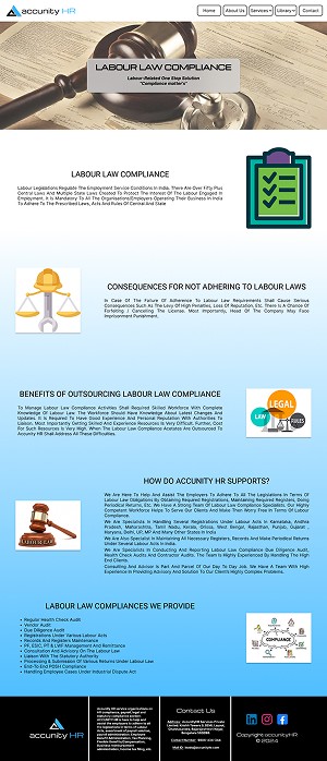
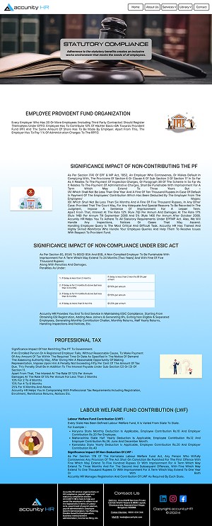
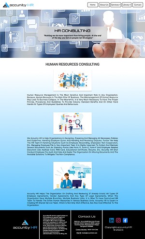
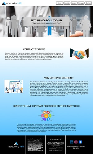
Problem Statement
Users can’t easily understand what accunityHR offers and how to access services, leading to high bounce, low conversions, and weak brand trust.
accunityHR’s existing website suffers from:
Poor content hierarchy and unclear navigation, making it hard for users to quickly find services, compliance resources, or contact info.
Visual clutter and outdated UI, which undermines credibility for corporate/Human-Resource clients seeking professionalism.
Lack of clarity around services and offerings, causing potential clients to leave without exploring or contacting hurting lead generation.
Problem Solution
What I aimed to deliver :
A clean, minimalistic UI redesign to communicate professionalism, trust and clarity.
A restructured information architecture to ensure services, compliance support, library/resources and contact paths are obvious and easy to reach.
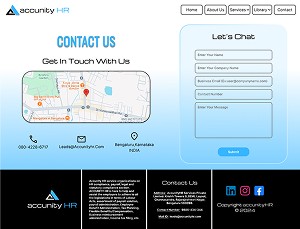
Clear call-to-actions (CTAs) so potential clients can quickly contact HR consultants or request services.
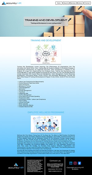
A modern landing page and service cards UI to showcase major services first, reducing noise and increasing conversion potential.
Target Audiences
HR Managers & Business Owners: 30–50 yrs, looking for outsourced HR/compliance support, expects clarity on services & easy contact.
Job seekers & Candidates: 22–35 yrs, exploring recruitment services, expect simple navigation and clarity on staffing process.
Startups & Small business Founders: 25–40 yrs, need staffing/HR services, expect quick info, transparent pricing/offerings.
Approach
Conducted heuristic review of existing site + competitor benchmarking (other HR / staffing service websites).
Planned a content audit to identify redundant, outdated, or poorly organized pages.
Designed low-fidelity wireframes → high fidelity mockups (in Figma) reflecting new IA and UI style.
Ran qualitative & quantitative research (hypothetical) to model user needs.
Applied iterative design + usability testing with 5 sample users to refine UI and navigation flow.
Built a design system (colors, typography, spacing, reusable UI components) for consistency and scalability.
Design Thinking Process
Empathize: User research and Interview.
Define: User persona, Goal statement and Empathy map.
Ideate: Brainstorming, Card sorting and User flow.
Design: Wireframe, Visual design and Prototype.
Test: Usability testing refined navigation and layout clarity.
Empathize Phase
Qualitative Research
To understand user needs and expectations, I began the empathize phase with qualitative research focused on working professionals and business decision makers who use HR service platforms. Through one-on-one interviews, I explored how users browse HR websites, what information they look for first, and what influences their trust in a service provider.
This research helped me identify behavior patterns, mental models, and key friction points in the existing AccunityHR website, directly shaping decisions around navigation, content hierarchy, CTA placement, and overall visual clarity.
Interview Questions
When you visit an HR service website, what information do you expect to find immediately?
How long should it take to find service offerings or contact info?
What makes you trust or distrust an HR company’s website?
Which section confuses you or feels cluttered on the current site?
Key Insights
Many users said they leave if they can’t see clear services within 5–10 seconds.
Users associated clean design and whitespace with professionalism and trust, heavy layouts felt amateurish.
Navigation menus with too many items frustrated users, they preferred simple menus and direct service cards.
Users valued visible contact / call-to-action buttons more than long text blocks about history or service details.
Quantitative Research
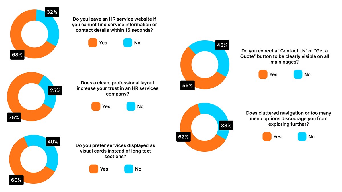
To validate the qualitative findings and support design decisions with data, I conducted a quantitative survey among 50 working professionals and business owners who frequently interact with HR service or staffing websites. The goal was to measure common behaviors, expectations, and preferences related to navigation, layout, and trust signals. Survey was focused on binary (Yes/No) questions to keep responses clear and measurable.
Key Insights
A majority of users quickly abandon websites that do not communicate services or contact options within the first few seconds.
Visual clarity and clean UI play a major role in establishing trust for HR and business service platforms.
Users show a strong preference for card based layouts, which improve scannability and reduce cognitive load.
Clearly visible call-to-action buttons are essential for improving engagement and lead generation.
Overloaded navigation negatively impacts exploration and increases drop off rates.
Define Phase
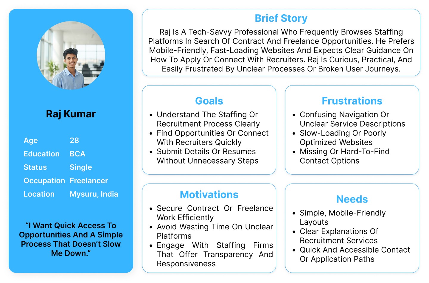
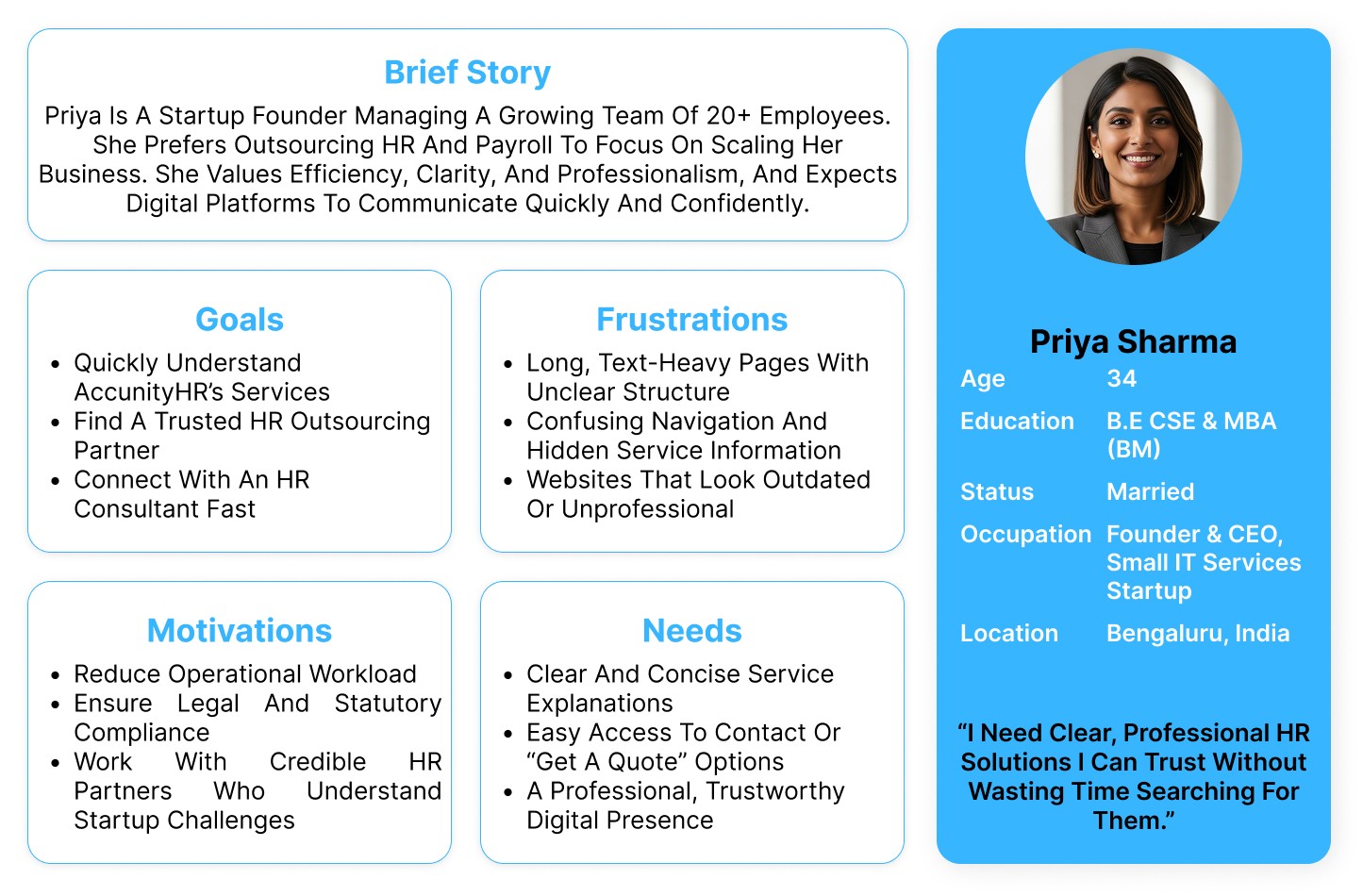
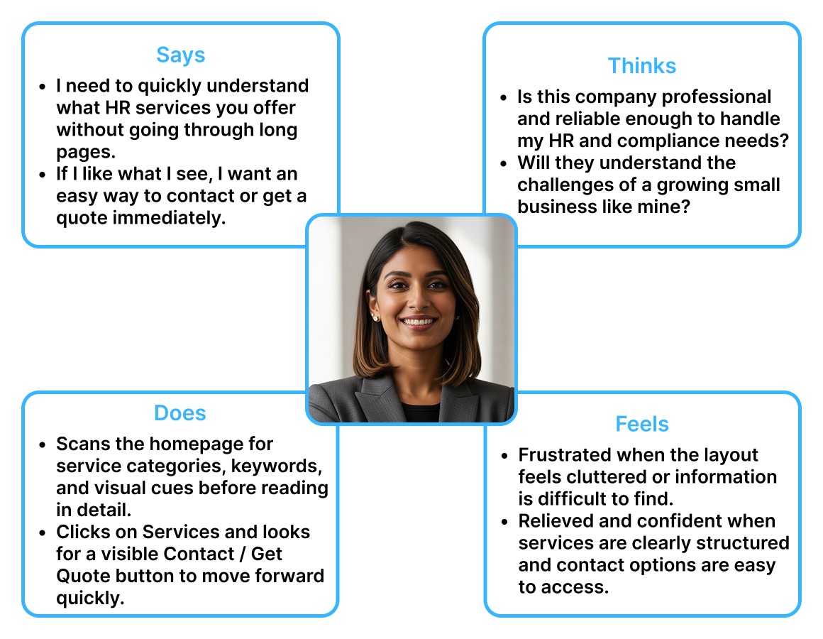
User Persona
Empathy Map
Ideate Phase
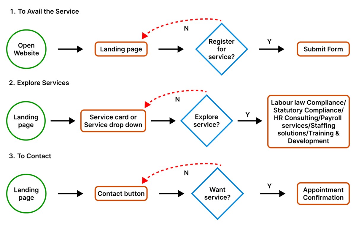
User Flow
Card Sorting
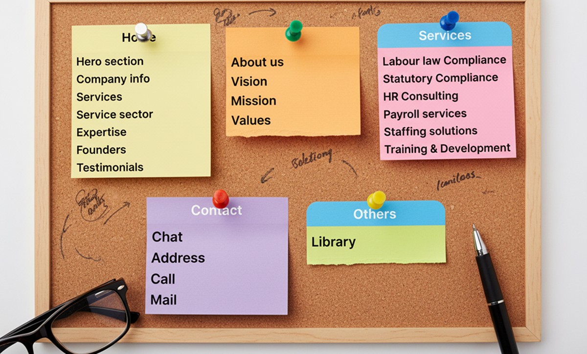
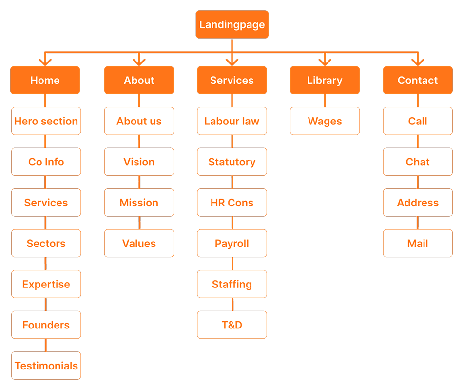
Information Architecture
Design Phase
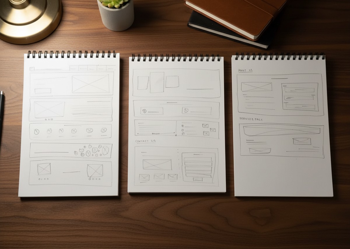
Paper Wireframe
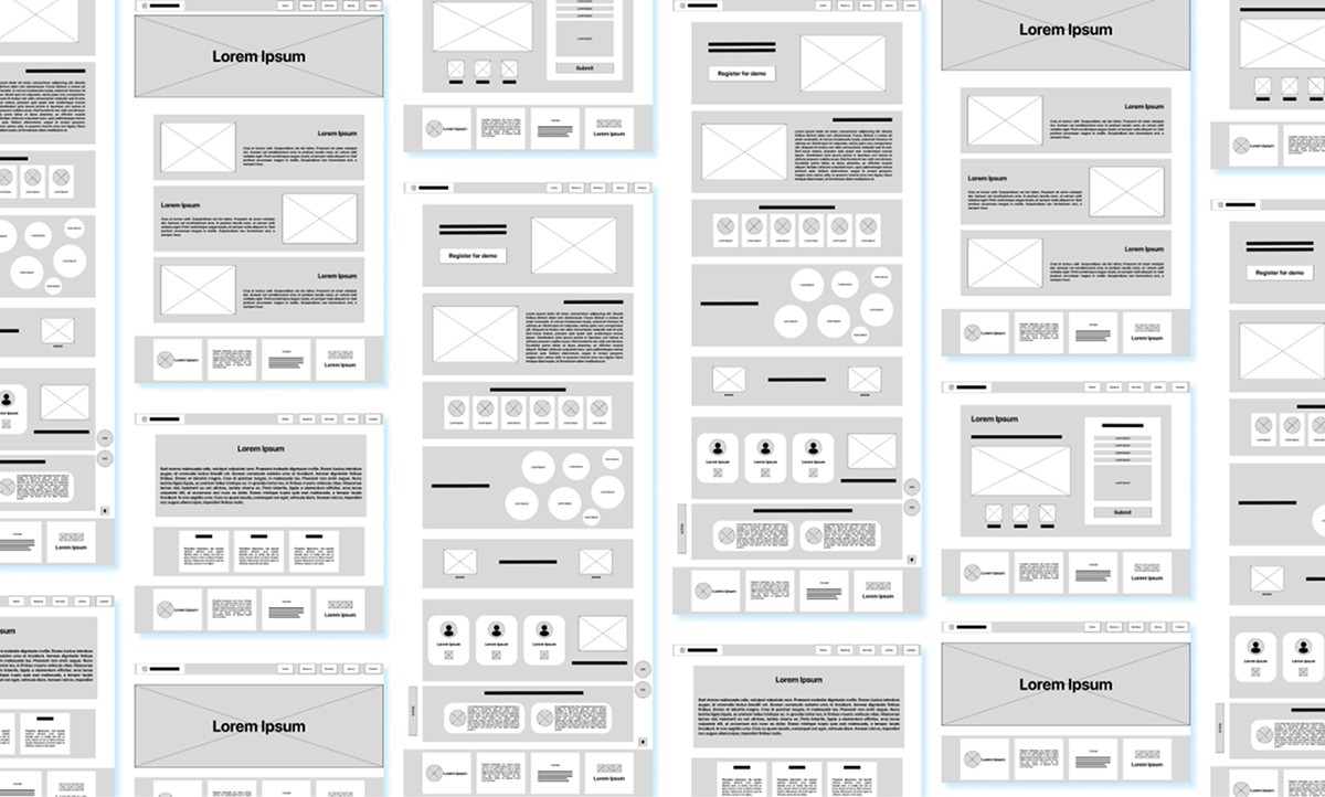
Mid Fidelity
High Fidelity
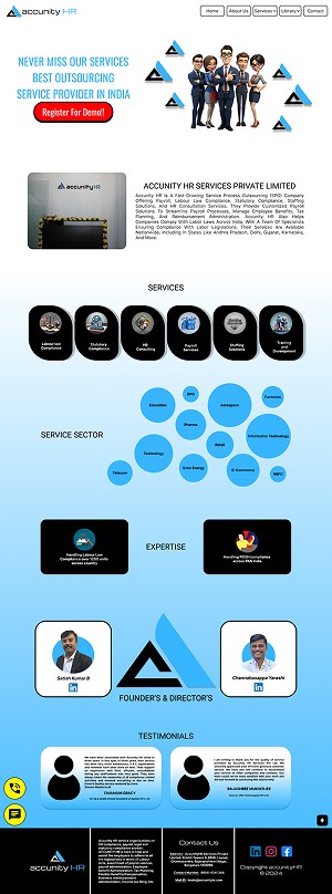
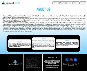

Visual Design
Test Phase
Usability testing was conducted with sample users to evaluate navigation flow, service discoverability, and CTA visibility. Feedback and survey insights were used to iteratively refine layout structure, hierarchy, and interaction clarity.
More Works More Works


